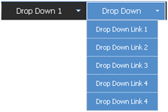
SharePoint has quite a few different drop down menus, within this post I will highlight the three primary drop downs and the CSS that drives it.
The Main Navigation drop downs are a new addition to SharePoint from its previous SPS 2003 version. Here are the following classes that make up this navigation:
| Class Name | Details |
| .ms-topNavFlyOutsContainer | This is the outer container. Modify this for the outer border. |
| .ms-topNavFlyOuts{ | This is the inner container. Modify this for the drop down background and basic fonts. |
| .ms-topNavFlyOuts a{ | This class specifies the drop down items, width, color, and padding. You might want to put in a width: 100% !important; tag in case you have an instance where you have a small drop down item and an item that its characters exceed 120px. |
| .ms-topNavFlyOutsHover{ | This class specifies the hover state of each drop down item. You will also want to put in width: 100%; into this class as well so that you don't get a default color background that you don't want. |
 The SharePoint team also put into place a little hidden gem of logic that states that when a list is longer than the height of the page, it will create a scroll type drop down.
If you move your mouse to the top arrow it will scroll up, and if you move your mouse to the bottom as expected it will scroll down.
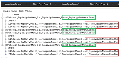
If you look at the image below the screen capture has 4 main navigation items all with drop down items. The ID's highlighted in green specify the Top Navigation Menu Item # 1, 2, 3, 4. For each navigation menu item if a drop down is available SharePoint will add in two div tags. The first one is the Menu Items Up which has an Image drawn from the /WebResource.axd file. The second DIV tag right below it is the Menu Items Down which also has an Image drawn from the /WebResource.axd file.
If you really needed to customize this you could simply add the following classes to your alternate stylesheet. But you would have to make sure you create as many Menun #s per how many top navigation items you have on your site.
| Class Name | Details |
| #zz1_TopNavigationMenun1ItemsUp{ #zz1_TopNavigationMenun1ItemsDn{ | This class is for the top and bottom boxes only for the 1st navigation item with a drop down. |
| #zz1_TopNavigationMenun2ItemsUp{ #zz1_TopNavigationMenun2ItemsDn{ | Same as above but for Menun #2 |
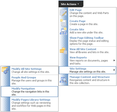
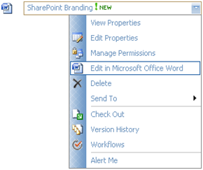
The Site actions drop down is a bit more complex. It uses quite a bit more styles than the main navigation. Here are some things to consider when branding this menu:
- Define the color of the text, both Heading and description
- Define what kind of image treatment you want behind the icons.
- Define the hover state as a user moves the mouse over each item. (Background color, and Border line)
| Class Name | Details |
| .ms-MenuUIPopupBody TABLE | This class specifies the Basic menu color for the Bold Menu Label. However it could be over written see below. |
| .ms-MenuUISeparator,.ms-MenuUISeparatorRtL,.ms-MenuUISeparatorLarge,.ms-MenuUISeparatorLargeRtl | This class specifies the color of the separator line. |
| .ms-MenuUI,.ms-MenuUILarge,.ms-MenuUIRtL,.ms-MenuUILargeRtL | These classes represent the overall background color. |
| .ms-MenuUILarge | This class is specific to all large size drop down menus. Including the Welcome, and My Links drop down. |
| .ms-MenuUILabel{ | This class specifies the bold menu labels padding. Since the color is not specified here but driven by the Pop up table. You could overide the color by adding it in here. |
| .ms-menuitemdescription | This class specifies the color of the description text for each menu item. |
| .ms-MenuUIItemTableHover | This class specifies the hover state when a user moves their mouse over each item. |
Both of the examples above use the same menu classes. You will notice that the space dedicated to the icons is allot smaller. All the classes for the large drop down are shared but for this menu it uses the following class to specify its smaller background image.
| Class Name | Details |
| .ms-MenuUI | This menu specifies the smaller graphic. |
One last thing to consider is if you are deploying language packs that change the orientation of text to read right to left. The navigation will also be change.
Here are the classes that make up the right to left menus:
| Class Name | Details |
| .ms-MenuUIRtL | Background image for small right to left menus |
| .ms-MenuUILargeRtL | Background image for large right to left menus |


Nenhum comentário:
Postar um comentário